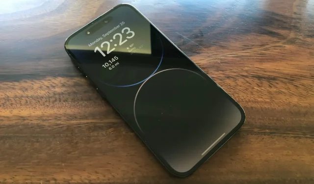
5 Ways Apple Can Improve iPhone 14 Pro Always-On Display with Software

Now that I’ve had enough time to get used to my iPhone 14 Pro’s always-on display, I have a few thoughts and feelings about how Apple can make a few simple software tweaks to improve the overall user experience.
Before we get into that, I have to say that I love the idea of an always-on display. And no, I don’t want to turn it off completely. In the end, my main problem with the always-on display is that it’s confusing. It often makes me think about what’s going on. Is it included? Is it off? Can I click here and do it? Why is he still completely black? Why doesn’t he wake up? I’m confused and I bet I’m not the only one.
So here are 5 things I think Apple can do to make the iPhone 14 Pro always-on display less confusing and overall better.
1) Add system switch to hide wallpaper
This is the most obvious way Apple can improve the user experience. Just add a toggle in your system settings so that instead of displaying a dimmed version of your wallpaper, the background is completely black. Not only will this save battery life, but it will also make the dimmed display less confusing.
2) Add a toggle to hide notifications
Notifications on the dimmed display of the iPhone 14 Pro are confusing for the simple reason that you can’t see them enough to know what they’re really about. And personally, I would prefer not to see them at all until I wake up the display. Obviously this is personal preference, but I don’t think it’s too much to ask to simplify things by letting the user choose whether or not they want to see notifications when the Always-On display is dimmed.
3) Add a radio button to hide the Now Playing widget.
If you’re playing audio when the Always-On display is dimmed, you’ll see the Now Playing widget at the bottom of the screen. It’s a nice touch because it shows you what you’re listening to. But at the same time, it’s pointless because you can’t click on this widget, for example, to skip to the next song. Instead, you need to tap the screen once to wake it up and then again to skip to the next song.
This is another example where the user experience is confusing. I can see it, but I can’t do anything about it with one touch. This brings me to my next point…
4) Make the dark screen interactive
Going back to my previous example, how confusing is it that I see a Next button in the Now Playing widget, but nothing happens when I click it? I need to click on it a second time to go to the next song. The same goes for the widgets right below the clock. I see a widget. I click on it, but nothing happens. Of course, the screen comes out of a dimmed state, but it has clearly registered my touch, so why not reveal the target behind my touch?
5) Speed up screen wake up
I often find myself waiting on a dimmed always-on display to actually wake up. We’re talking fractions of a second here, but the bottom line is that I’m waiting, and I don’t have to wait for a nice animation to run in order to be able to use the device.
It gets even worse if you have an iPhone 14 Pro in your pocket. In this situation, according to Apple, the display is completely off. But when you pull your iPhone out of your pocket to skip to the next song, for example, it takes literally a few seconds to turn on. Not a fraction of a second. Seconds! As someone who walks a lot and pulls his phone out of his pocket several times during his daily walks, this has to be without a doubt the most frustrating experience with an always-on display. Just make the thing wake up faster!
I hope
I understand that the five points above may sound whiny. However, these are real problems that I think thousands of Apple employees and users face every day.
However, I hope Apple gathers enough feedback to make small changes to how the Always-On display works or how it’s configured using Settings. The most obvious one, which I’m sure we’ll see in iOS 16.2, is the first thing I did: the ability to hide the wallpaper when the display is dimmed.
And you? What do you think? Do you see how the always-on display of the iPhone 14 Pro can be improved?
Leave a Reply