The 2023 Guide to Creating Stunning Visual Content for Social Media

Just like the common crow is attracted to shiny things, social media users love good visual content.
As a rule, our vision is the first thing that is activated when viewing a post on social networks. And with so much content, it’s important for brands to stand out visually. Keep reading to learn how to create an effective visual content strategy for social media.
Visual content is any type of online content based on images. It contains a visual element – not only text, but also eye candy. For example, a classic 280-character tweet is non-visual, but a tweet with a photo attached is visual.
Types of visual content.
- Photo
- Video
- Carousel posts (multiple photos or videos)
- GIFs
- Illustrations
- infographics
- Animations
- memes
Videos and photos have proven to be more appealing than pure text messages across almost all internet platforms. LinkedIn posts with images have an average of 98% more comments, and tweets with visual content are three times more likely to get attention.
On Instagram, carousel posts have the highest engagement rate. According to this 2022 Statista data, the average engagement rate for any post on an Instagram business page is 1.94%. Carousel posts, on the other hand, have an engagement rate of 3.15% (not to mention, people like to swipe left).
It’s statistics like these that lead American marketers to say that videos are the most valuable for social media marketing. In a 2021 Statista survey, 54% of marketers said videos are valuable for social media marketing purposes — it was the most common type of named content.
And it’s not just marketers who notice the value of visual content. Consumers know they want to see content in the form of photos and videos. A 2021 Swedish study (also by Statista) found that when it comes to brands using social media, 47% of adults prefer to see content as images. 35% said they enjoy seeing brand content in video form.
1. Set a color palette for your brand
Choosing (and sticking to) a specific color palette or mood for your brand not only makes your feed beautiful, it also means your posts are instantly recognizable by your followers. Incorporate visual content into your social media style guide and create recognizable, compelling visual content right from the start.
For example, the viral nail polish brand Pleasing has a very pleasing color palette. Company posts are bright, bold and unique: they stand out from the crowd.
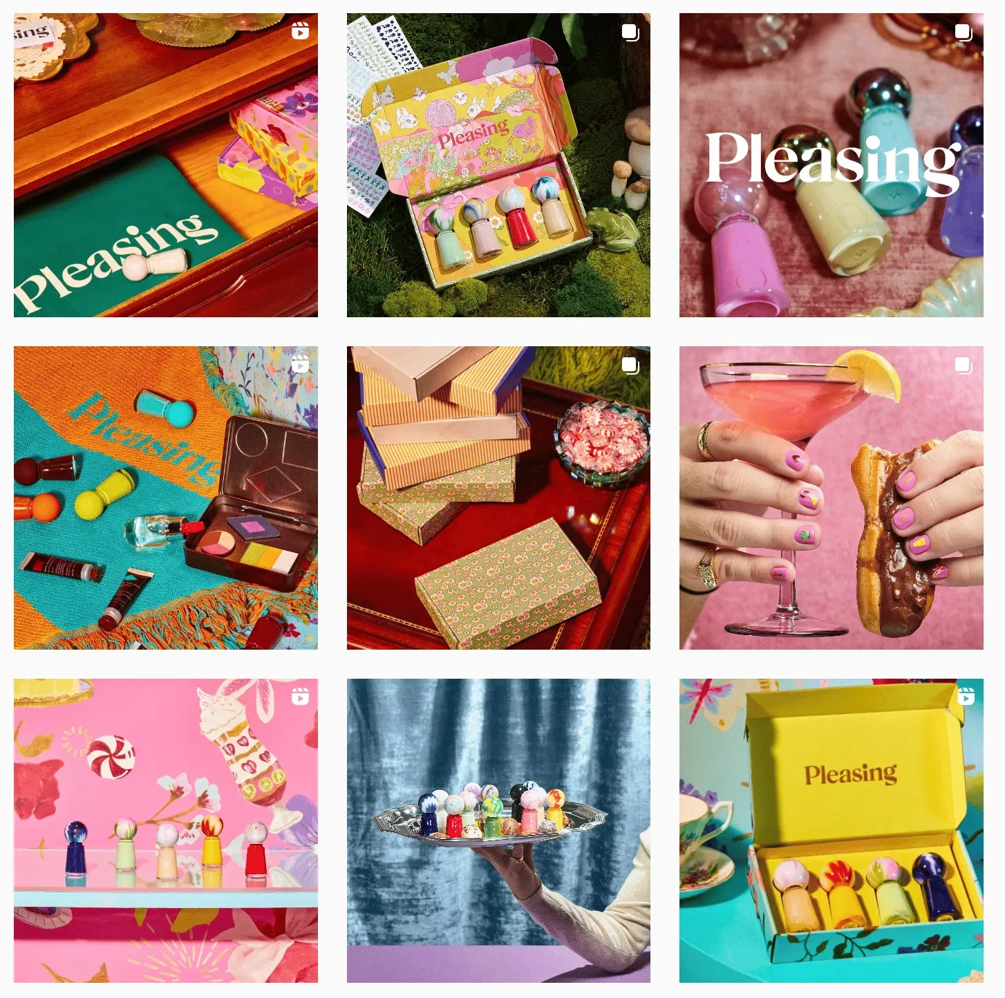
Source: Instagram
2. Choose attractive video thumbnails
When you post a video on social media, the thumbnail (or “cover”that the platform will use to display your content) is often automatically the first frame of that video. But the first frame of your video might not be the most exciting — or representative — image.
Manually select a thumbnail when posting a video (on IG Reels, TikTok, Youtube, etc.) and select the image that you think looks the most attractive or conveys the most information.
The thumbnail images for this bakery ‘s Instagram videos are very Insta-worthy, and they make the brand’s most iconic item (the cinnamon bun) the star of the show. Some thumbnails even contain text that gives the viewer an idea of what it is about, such as “Giving Peach Cinnamon Rolls”.
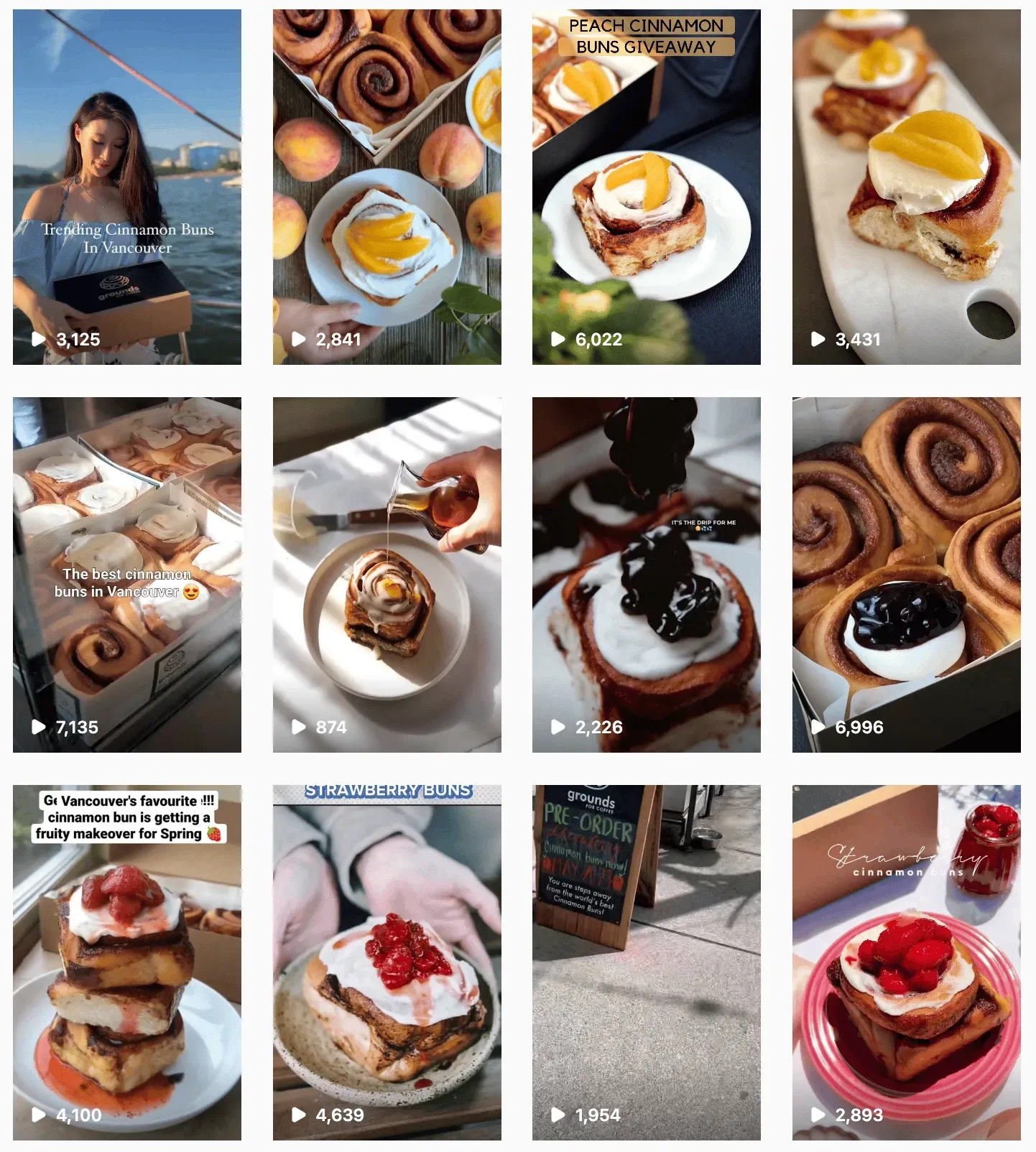
Source: Instagram
3. Incorporate Text into Visual Content…
Even if you are in the text industry, you can still use visual content in your marketing. Magazines have done a great job with this incorporation of text: the main goal is to showcase the story (based on the text), but the publication will use visual aids to promote that story.
For example, this Teen Vogue story is mostly text, not images, but the article still appears on Instagram Teen Vogue as a quality photo with text overlaid on it. This incorporation of text directly into the image makes the purpose of the image crystal clear and also makes the image very shareable (it can be easily added to followers’ IG Stories).
4. … but don’t use too much text
While text can be a great tool for conveying information, it’s not easy on the eyes. In fact, too much text can visually overwhelm viewers. Less is more when it comes to adding text to your visual content.
This New York Times post is a great example of careful text integration. The first image simply includes the title of the story, while the next one is a smart mix of visual content: there are photos and videos, as well as photos with text snippets included. It’s engaging, dynamic visual content that inspires viewers to dig deeper (in which case, read the full story on the NYT website).
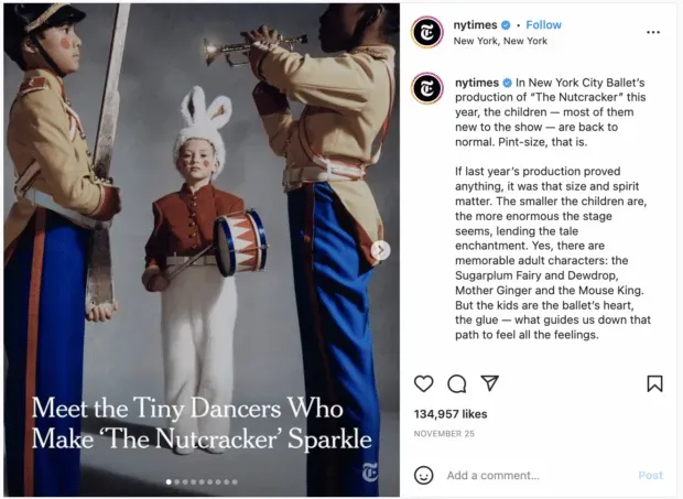
Source: New York Times on Instagram.
5. Use high-quality photos and videos
Yes, right? Visual content is primarily visually appealing, so make sure you don’t post blurry infographics or out-of-focus photos (unless it’s part of your brand, of course).
High-quality photos and videos are great to look at and also help showcase your brand and, in some cases, your brand’s influence or effect. This high quality photo post from Huda Beauty really showcases how well one of their mattifying products works.
If you don’t have the resources to take your own high-quality photos, visit stock image websites and create visual content using your favorites.
6. Understanding Image Copyrights
Finding the right images isn’t always easy, especially when it comes to copyright. But this is important, especially since serious consequences follow for misuse.
When using stock photos, templates, and illustrations, read the fine print. If anything is unclear, contact the image owner or site for more details.
The same goes for licensing and contracts. When drawing up contracts with artists, it should be clear where you are going to use the creative, who owns the rights to it, etc.
When required (which is often the case), be sure to give credit where appropriate. This is also true if you plan to repost or share user generated content. Some companies, such as Agoda, even use contractual agreements in this context.
Disney World’s official Instagram often posts user-generated content with the original poster credited in the caption.
7. Add your logo (if necessary)
If you plan to share your visuals, it might be a good idea to include a logo.
Pinterest is a great example. Anything pinned can be re-pinned, and without a logo, it’s easy to forget where it came from. Also, according to Pinterest, icons with subtle branding tend to perform better than those without them. Ikea includes its logo on almost all of its pins (many shared tens of thousands of times).
Good branding is noticeable but not intrusive. This usually means placing a small logo in the corner or on the outer frame of the image. If the color of your logo conflicts or makes the image look too busy, choose a grayscale or neutral version.
The National Geographic logo is a good example of subtle branding – the yellow box is featured in almost all of their posts across all platforms.
8. Image size specification
One of the biggest crimes you can commit when sharing visuals on social media is using the wrong size.
Images with the wrong aspect ratio or low resolution can be stretched, cropped, or compressed out of proportion, all of which reflect badly on your brand.
Each platform is different and you should tailor your content accordingly. We’ve put together a guide to social media image sizes to help you.
Always aim for the highest image quality. This includes pixels and resolution.
And don’t ignore the aspect ratio. Why? Some platforms automatically crop image previews depending on the aspect ratio. Therefore, if everything is different for you, you may get an unsuccessful harvest or miss important information.
9. Start your video with a hook
When creating videos for Instagram, TikTok, and even video content for Facebook, Linkedin, and Youtube, make sure the first few seconds are interesting and entertaining (if they aren’t, your audience will likely scroll further down the video).
For examples of how to get your visual content off the hook, look at food content creators – they are great at getting you hooked on the end product so you stick around to learn the whole recipe. This tofu recipe starts with the creator running a knife over an (impressively) crispy tofu, which immediately sparks curiosity. The sound of the knife and the creator’s bold opening line (“I hate tofu”) only add to the appeal of the visuals.
@fitgreenmind Yes, tofu can taste good! ? #veganlunch #vegandinner #tofu #tofurecipe #easyrecipes
10. Take advantage of free tools and resources
It’s almost always better to hire a photographer or graphic designer to create custom content for your brand.
But if you’re on a budget or need a few extra tools, there are countless resources available, and many of them are free.
Here are some of the best design resources and tools:
- 38 Free Stock Photo Resources
- 24 Best Instagram Apps for Editing, Designing and More
- 72 Free and Customizable Instagram Story Templates
- 5 Free and Easy to Use Lightroom Presets for Instagram
- 9 Inclusive Design Tools and Resources
- 5 Free Facebook Cover Templates
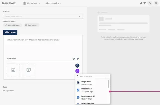
Some social media management platforms have photo and video editing built right into their dashboards… Hootsuite has Canva, for example.
No more switching between tabs, digging through your Downloads folder and re-uploading files – you can access Canva’s endless template library and create beautiful and effective visuals from start to finish without leaving Hootsuite Composer.
To use Canva in Hootsuite:
1. Sign in to your Hootsuite account and go to Composer.
2. Click on the purple Canva icon in the lower right corner of the content editor.
3. Select the type of visual you want to create. You can select a web-optimized size from the drop-down list, or create a new custom design.
4. When you have made your selection, a login popup will open. Sign in with your Canva credentials or follow the instructions to create a new Canva account. (In case you’re wondering, yes, this feature works with free Canva accounts!)
5. Create your image in Canva.
6. When finished editing, click Add to Post in the upper right corner. The image will be automatically uploaded to the social post you create in Composer.
11. Include descriptions with alt text
Not everyone perceives visual content in the same way.
When creating a social media creative, make it accessible to as many people and contexts as possible. Accessible content allows you to reach a wide audience and possibly edge out non-inclusive competitors in the process.
More importantly, it helps you earn the respect and loyalty of your followers (and future followers).
Available visual content on social media may include:
- Alternative text descriptions. Alternative text allows visually impaired people to better understand images. Facebook, Twitter, LinkedIn, and Instagram now provide image description fields with alt text. Here are some tips for writing descriptive alt text.
- Subtitles. All social videos must contain captions. Not only are they important for hearing-impaired viewers, but they also help in situations where there is no sound. Language learners also benefit from subtitles.
- Descriptive transcriptions. Unlike credits, these transcripts describe important sights and sounds that are not spoken or obvious. Descriptive audio and live descriptive video are other options.
While TikTok automatically shows the audio each video uses, this content creator uses captions to show exactly what part of the song they’re referring to to make sure everyone gets the joke.
@realchelseabear If I had a dollar for every dirty look I’ve gotten ??♀️ #CerebralPalsy #Disability
12. Pay attention to trends
It is important to stay up to date with the latest trends on each platform. This will not only help you stay connected with your audience; Trends are a great source of inspiration if you find yourself running out of creativity.
The trends aren’t just visual, of course, but some of them have a visual element that’s instantly recognizable – like Horace’s dance trend on TikTok.
@sarahdame91 Dc: horace ?? #dance
13. Plan your visual content
You can create the most engaging, thought-provoking visual content to share… but if people don’t actually see it, it won’t matter.
Due to the huge number of social media users (over 4.62 billion people worldwide use social media), you will always get at least a few viewers for your post, however you can greatly increase your chances of your content getting popular.. disables by posting when your audience is actually using the platform.
We’ve rounded up the best times to post on Facebook, Instagram, Twitter, TikTok, and Linkedin so you can set yourself up for success. Set it and forget it (multi-cooker style) using Hootsuite’s scheduler and scheduling tool to make sure your content goes live at the best time.

14. Be mindful of representation
Do the people in your images reflect the diversity of your audience? Do you reinforce gender or racial stereotypes with your images? Do you promote body positivity? Here are a few questions you should ask yourself when creating visual content for social media.
It’s not just socially responsible, it’s smart. It is much easier for someone to imagine themselves using a product or service if they see that someone is similar to them. Look at your audience analytics or the demographics of your desired market and factor them into your creative process.
The performance must be more than just optics. If you have the means to diversify your team, do so. Hire women, weird people and color makers. Offer as many points of view as possible.
At the very least, try to get feedback from as many people as possible before sending your content out into the world.
A great example is Lizzo’s Yitty brand – the brand’s visual content represents its target audience.
9 Examples of Visual Content From Brands That Do It Right
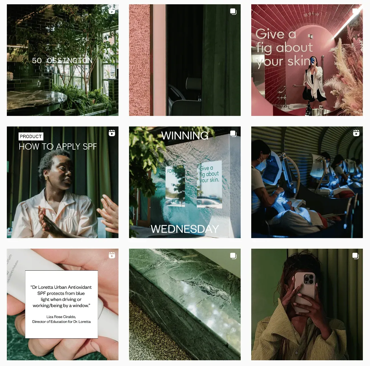
1. Permanent Formula Fig Color Palette
Picking a color palette and sticking to it pays off – just ask for this skincare brand’s super-aesthetic pitch that perfectly captures their visual personality.
Source: Instagram
2. Attractive Instagram visuals
Who better to trust visual effects than a visual artist? Instagram’s collaboration with the Trevor Project and artist @beeillustrates is a great example of sharing (very important) information.
3. Ocin event images to share
Speaking of sharing, swimwear brand Ocin creates easy-to-read stylish graphics for event announcements. All information in one image makes it easy to share an event in history or send to a friend.
4. JessaKae Inclusive Videos
When it comes to visual presentation, JessaKae excels at it. Many of the brand’s videos showcase how inclusive their sizing is, using models that represent their diverse consumer base.
@jessakae One dress, 4 colors, available in 12 sizes. Our Wendy dress is a crowd favorite ⭐️ #inclusivefashion #sizeinclusive #midsizefashion #plussizeedition #boutique
5. Simple Animation Bailey Nelson
Eyewear brand Bailey Nelson takes “less is more”seriously when it comes to text in their visuals, but animation makes it interesting.
6. Flax Home Limited Text
Here’s another example of how limited text can be effective: a raffle ad from Flax Home. Most of the information is in the title of the post, so the visual itself looks very neat.
7. Sticky Lollies Video Hooks
This confectionery company engages viewers from the start with visually appealing clips in the first few seconds of each video. They also appeal to a sense of mystery – the audience will stay to see what the final product is all about.
@stickyaustralia Can you see our designs?
8. Chanel Creative Carousels
If you have an image that isn’t exactly the right size for the platform, there are creative ways to get around it. For example, you can rasterize (slice) an image and post it as a carousel, which will result in the cool sliding image below.
9. Dylan Sprouse’s whimsical grid
Want to see one of Dylan Sprouse’s old Instagram posts? Too bad they can’t: The celebrity has applied some very strange visual branding on her IG profile, posting 8 hand-drawn images that look like a living room combined, leaving only one spot (upper left) for a photo… that’s where the TV screen is. So every time he posts a new photo, he deletes (or archives, it’s impossible to say) the previous one.
Source: Instagram
This is a strange example to leave you with, but it certainly proves that when it comes to visual content, creativity goes a long way. Take a chance or two.
Leave a Reply