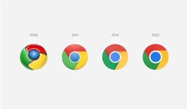
Google is changing the Chrome web browser icon

Google is changing the icon of its Chrome web browser, a relatively small but noticeable change.
If you have recently downloaded the latest version of Google Chrome Canary, you may have noticed that the app icon has changed. The change is the first in eight years, the first since Mountain View redesigned the symbol representing its popular iconic browser. At first glance, one might say that nothing has changed, but there are changes, although the eye does not necessarily see them. In a Twitter thread discovered by The Verge, Google designer Alvin Hu details the process that led to this new design.
Google is changing the Chrome web browser icon
If you look closely, you’ll notice that Google has removed the shadows that were present on the previous icon, so they opted for a flatter design more in line with the company’s other products. The proportions have also been changed in the icon, and the colors have become brighter. It is quite possible that the most noticeable influence made by the Google designers is the introduction of very subtle gradients in the green and red segments. Alvin Hu explains that the company has found that certain shades of these two colors create an “unpleasant color vibe”when placed next to each other. An example of the phenomenon that Alvin Hu talks about can be seen on his website. In any case, the result of this change is a “more accessible”icon.
Relatively small but noticeable changes
Depending on where you use Chrome, you may or may not see some additional changes. This is because Alvin Hu explains that Google spent time tweaking the icon to be more in line with the operating systems where Chrome is available. For example, on macOS, the icon will look more three-dimensional. On the other hand, for iOS, there is a special version for the beta version of the browser. According to Elvin Hu, the rollout of this new icon will be completed in the coming weeks.
Leave a Reply